


Organizing Content from Instagram to Website
Catherine Dantas Responsive Website

Catherine, supporting moms online
@catherinedantas_ is a Brazilian Instagram account focused on helping autistic moms and professionals with support, information, and sharing experiences of herself, her son, and her family about Autism Spectrum Disorder (ASD)
Comfort | Easy-to-use | Clean & Clear


Research Overview
• Research Ramp-up
• Provisional Personas
• Users Interviews
Research Ramp-up & Provisional Personas
We decide to research other websites that could inspire autistic moms and have similar approaches to understand the priority chosen for their information, categorization of it, and possible patterns between them.
After analyzing these inspirational websites, and given to a wide range of information for different stages in kids’ ages, we determined some potential users, that were moms in different stages since discovering their kids' diagnosis to the evolution of them, and one of the family/friends supporters.

Click on the Image to see it full
Main Points
• We researched 2(two) Brazilian websites, 1(one) American blog, and 2(two) Instagrams that are similar to Catherine’s
• The Brazilian website wore more focused on information about diagnosis, treatments, Rights, and inclusion
• The American blog was focused on sharing routines
• The Instagrams were focused on sharing activities, routines, and some motivation words for moms
User Interviews
To categorize and organize all the Instagram content we needed to understand what were the main points and the pain points of Catherine’s followers, and other autistic moms. We needed to determine what kind of content was necessary for them, how this content affected them, and how prioritization and choosing content access worked for them. We chose then work with some User Interviews and understand it direct from these users.
Main Points
We interviewed 4 autistic moms between ages 28 and 47
3 of 4 were Catherine followers on Instagram
2 of 4 mentioned that already requested help from other moms, like Catherine in social media
2 of 3 catherine followers mentioned to miss more book translations that Catherine used to do
Users suggested what content they expect for the website:
Family interaction with autist son and how she deals with it
How to work the autistic's autonomy
Teach moms how to delegate
Look for purpose in life
Work mom’s mindset and positivity
Get the family involved
A section like a mom’s megaphone that could give space for moms to share frustrations and fight for
their rights
Her examples of inclusion in America are a referral of hope to the lack of Inclusion in Brazil, and how far they could fight for. Show how inclusion is in America, like in diagnosis, therapies, and routines
Step-by-step activities
Catherine’s relationship with her faith, acceptance, and beliefs
Personas
After user interviews, we could notice what information the moms needed, and we could get a list of what they potentially considered to be prioritized in the website's content. Now we needed to categorize this content for our users, then we created our Personas to contextualize and guide us through the project, as you can see below.
Click on the image to see it full
Click on the image to see it full
Main Points
• We created 2 personas: the new mom and the experienced mom
• Inspired by the users interviews we separated their goals focused on their kids phases and consequently their own stages in dealing with the diagnose and treatment. We noticed that depending on their kids ages and phases they have different needs, frustrations, and consequently the preferred content of the website should vary as well, as you can see in the 2 personas: Mariana and Andrea.

Problem Statement
After having research and personas done, we decided to focus again on the problems that needed to be solved.
We choose the problem statement to identify any gaps between the current state to the future state. We created POVs with our personas, Mariana and Andrea, and identified How We Might get the Solutions.
The POV had focused on our main challenges that were categorized and organize the content from Instagram to the Website in easy-to-access information for our users, autistic moms and Catherine’s followers on Instagram.
Click on the image to see it full
Card Sorting
With some content and different information, we decided to use Card Sorting to help categorize and prioritize it into topics. As we mentioned in the Problem Statement, this could be a great opportunity to guide us in understanding our user's prioritization choices. We needed to understand how do our users choose content access and how this worked for them, and how this content affected them. With Card Sorting, we could validate or not what we learnt with the user's interviews.
Summary
Hybrid Card Sorting
10 Participants
All Catherine’s Instagram Users
19 Cards
4 Suggested Categories
The Card Sorting was made in Portuguese, language most used by Catherine’s users
Card Sorting Insights
After the users interviews and the Card Sorting, we can conclude that the users understand the Mom Support as a mix of Family + Faith and Autist Support. So the suggestions we get from Card Sorting from our users is that we should eliminate the “Mom Support” category and use only 3 Categories instead of 4, and rearrange some items from categories as we can see below with the 3D cluster view.
Categories & Cards used
Categories:
Autist Support
Mom Support
Family + Faith
Inclusion + Rights
Cards:
The power of Faith
The Autist Mom
Marriage and Autism
Checking your kid’s development
How does it work today: diagnosis, treatment, support
How did everything started in US
Courses
Potty Training
Stimulating your kid
ABA Strategies for day-to-day
Family and Autism
Tipical brothers and autism
Books
Megaphone: your voice is important
Words of Care
Printables
Positive Inclusion references
Reflections
Your rights: Brazil x USA
Card Sorting Result
Click on the image to access it full
Sitemap
The natural journey takes us to our Sitemap, inspired by the great results of Card Sorting.
Click on the image to access it full
Main Points
• Surprisingly, one of the topics “Mom Support” were eliminated. Instead, we shared the Mom Support content into Family+Faith and Autist Support.
• We respected what users opted in the Card Sorting Result for the website content.
Task Flow
After the Sitemap and Categories had been suggested by users in Card Sorting, it is time to validate these categories and understand any pain point our users could have in finding easily their content. We created Task Flows for our personas.
Click on the image to see it full
Main Points
• The first Task Flow was made to Mariana focused on the beginning of the diagnose information and the second Task Flow was made to Andrea focused on the comfort for moms.
• This helped us focused on the priority of content, how it would be find and what should be important to be shown in the homepage, for example.
User Flow
To give overall picture of the website, we made the User Flow.
Click on the image to see it full
Main Points
• We could understand every step the user should do to access information and be more prepared to the Ideation stage next.

Wireframes
Based on the information gathered, We sketched some ideas on paper and created the wireframes, and give the first step into the visual design. Because our plan initially was to make the website in the Squarespace, we choose the wireframes similar to the options they already have. The idea was that Catherine in the future could have in Squarespace more flexibility to add and edit content whenever she prefers.
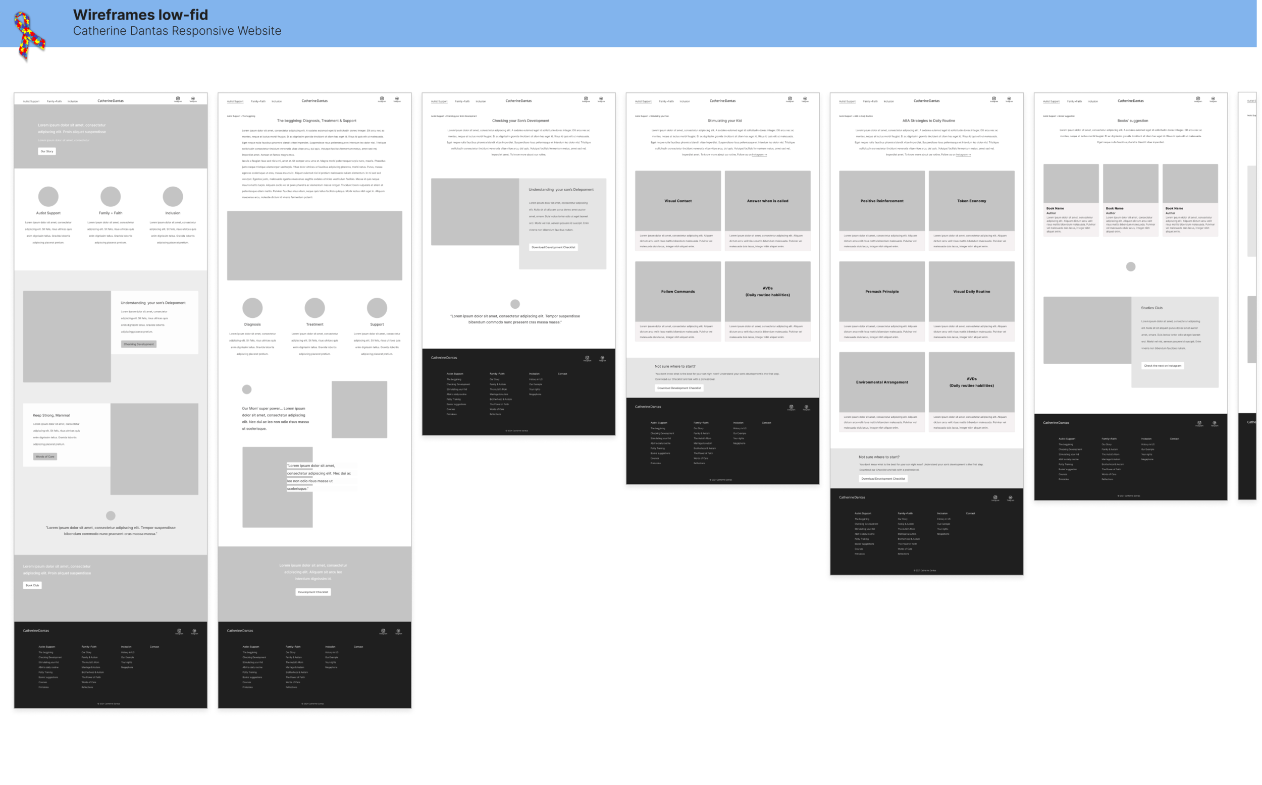
Click on the image to see it in full
Style Tile
To give us visual direction for the high-fidelity designs, we created the Style tile. As our users are autistic moms, and in users' interviews mentioned comfort, positive mindset, family, relationships, and Brazil; we decided to bring some joyful colors, cool outlined icons with powerful emotions like heart, sun, and ballons. The idea was to make them feel comfortable and embrace the visual design combined with the content.

Click on the image to access it full
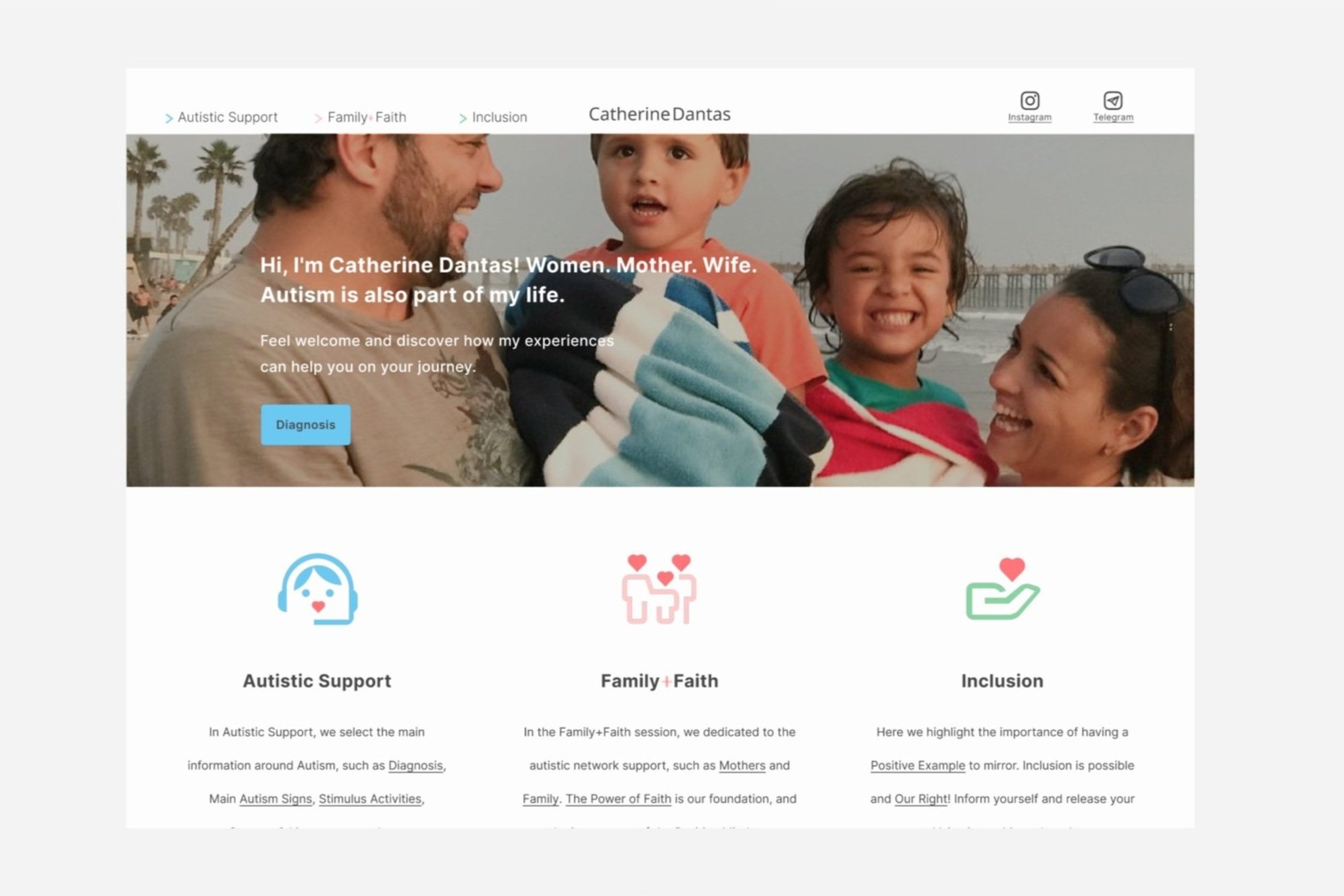
UI Responsive Design
Following wireframes ideas and Style Tile, inspired by all the researches and deliverables, our website starts to get colors, forms, and content. The amount of content made us include some fast links to the content page, and let the website be more usable for the users. Some pages were renamed after wireframes, and some changed the blocks of images and text format to be more similar to the ones presented on the homepage. Check below the UI Desktop, Phone, and Tablet. As you can see they have small differences to adapt for each device, but all of them kept the same patterns and style, but with better usability for each device.
UI Desktop

Click on the image to see them in full
UI Phone

Click on the Image to check images in full
UI Tablet

Click on the image to access it full

Prototype
Our prototype start point was the desktop that was the device we would like to try with the users. We choose 3(three) main pages that were the ones with more content, then they represented our challenge at most: organize and categorize the content. Our main goal with prototyping now was to understand if the website had a natural flow and no surprising obstacles, and of course, match the usability test goals as well.
Desktop Prototype
Phone Prototype

Tablet Prototype


Usability Test
Our main goals with the usability test were to check how the process of finding information was working, check if the user could complete the task easily, and identify any pain points. We created 2(two) Tasks and some questions that the answers could help us find some pain points that could be an obstacle to the usability of the website. The test was made by zoom with a Figma prototyping link. The users were recruited through Catherine’s Instagram, they were all her followers.
Summary
• 4 (four) Participants
• 100% Task Completion Rate
• 0(zero) Error Free Rate
Task
Scenario 1: You think your kid is showing signs of Autism Spectrum Disorder. You would like to check which signs in your kid's development could mean you need to look for a doctor. You find Catherine's website, and you are on her Homepage website. What do you do?
Scenario 2: Find Activities to do with your kid at home.
Insights
• 3 of 4 choose the CTA in the Homepage
• 3 of 4 suggested a page for Autistic professionals
• 1 of 4 suggested a sign in the navigator menu indicating other subcategories
•All of 4 suggested that the pages “Stimulating your son” and “ABA to daily routine” should be one page together
1 of 4 suggested change “Our discovery” name page to “Diagnosis”

Affinity Map
We decided to use an Affinity Map to help us organize the information collected in the Usability tests, and to understand better our priorities reviewing the project.
Click on the image to access it full
Discoveries
The Usability test was really helpful and as you can see in the Affinity Map we had to make some priorities change to our design to get better usability for our users. We discovered that we need to change some page names that were easy, understandable, and small. And add some icon in the navigator to show that has a dropdown menu. The dropdown menu suggested for the topics navigation in the homepage, we decided to create hyperlinks in the texts, we believe the dropdown menu on the navigator and in the topics section could be overwhelming.
Takeaways
Each user is going to have a different experience with products, and the biggest challenge is to understand that our experience is not the same as our users. Naturally, we create assumptions, but testing is crucial to determine and validate them. On Catherine’s project, we started with the idea of focus on mom’s support. We wanted to find out what would be the content the users would like for this section, and for the rest of the site. The first user's interview already gave some signs that what is mom’s support for the users was not exactly a section for it, that the users understanding about Mom’s support was not the same as we did. The card sorting confirmed that when the users preferred that the page name Mom’s support shouldn’t even exist. They wanted the support in a more general way and not as a named section. It was a sensitive subject for them. We decided to share that “mom’s support” information on different pages and they accepted really positively in the usability test.
Catherine Dantas Responsive Website is an especial project to me. Catherine is an inspirational woman and mother, and this project made me see how deeply my job as UX Designer can be in making other people’s lives better, easier, and helpful. It is much more than a project. I appreciate Catherine’s trust and every single user interviewed for this project with their valuable feedback.
Next Steps
• Finish other Pages UI & Content
• Bring it to life